
As an essential part of the conversion funnel, most landing pages convert pretty poorly. The average landing page conversion rate across all industries is 4.02 percent. Let that sink in.
If B2B landing pages are a staple component to the lead generation funnel, why isn’t the conversion rate higher? Maybe it’s because businesses don’t pay enough attention to the key features of an optimized landing page.
So what are those key features? The following eight B2B landing page examples will show you.
What makes a good B2B landing page?
The best landing pages are direct, clear, and desirable. Let’s dig into each of these traits.
1. Direct
Your landing page has one agenda: to sell one product to one audience. Get clear on your call to action and target audience by asking yourself:
- What’s my landing page’s conversion goal?
- What type of incentives will lead users to this goal?
- How can I minimize distractions and direct users to my product?
2. Clear
Put your goals into action with clear landing page messaging from beginning to end.
- Personalize each call to action button. “Start your 30-day free trial” is much more specific than “Sign up.”
- Get rid of distractions, like navigation menus.
- Minimize hesitation with short forms (three fields or less).
- Provide high-resolution product images, videos, and GIFs.
3. Desirable
Logic doesn’t drive visitors to the “buy now” button. Emotions do. In fact, invoking awe, laughter, or amusement ups your chances of making a sale.
Pull at your audience’s emotions with extra incentives:
- Social proof: Add a real-time feed of testimonials. Or, encourage users to connect with your product even more with video testimonials.
- Security badges: Entering your credit card information is always a risk. A security badge assures customers that your company is safe from data breaches or cyberattacks.
- Add intrigue: Weave in a few jokes or inspiring stories on your landing page to capture visitors’ attention.
- Wow-worthy statistics: Is your product proven to boost productivity by 15%? Show off those numbers.
You’ve got the landing page basics down, let’s see these landing page optimization tips in action with eight B2B landing page examples and best practices.
8 Inspiring B2B Landing Pages (and What They’re Doing Right)
1. Shopify
Shopify takes a minimalistic approach to their landing page.
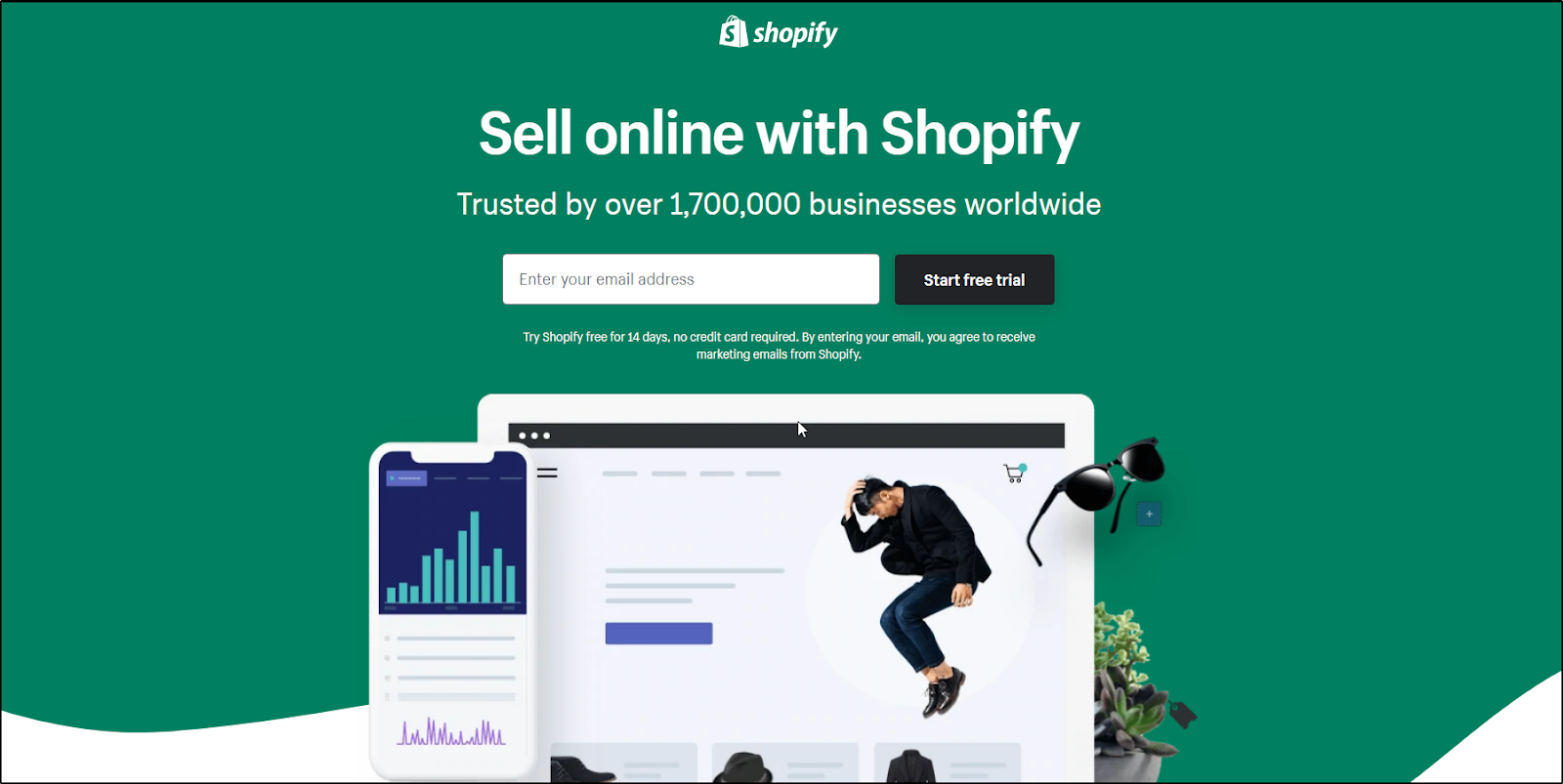
Their single-form field makes it easy to use Shopify right away. Also notice of how Shopify’s value proposition, “Trusted by 1,700,000 businesses worldwide,” combines social proof and security into one. If over a million businesses use Shopify, why shouldn’t you?
Take action: Long landing pages aren’t always the best way to go. Breadcrumbs can help you identify if your audience prefers an informative or simple landing page.
2. Zoho CRM
Zoho avoids filling their landing page with product benefits and features, choosing to focus instead on social proof.
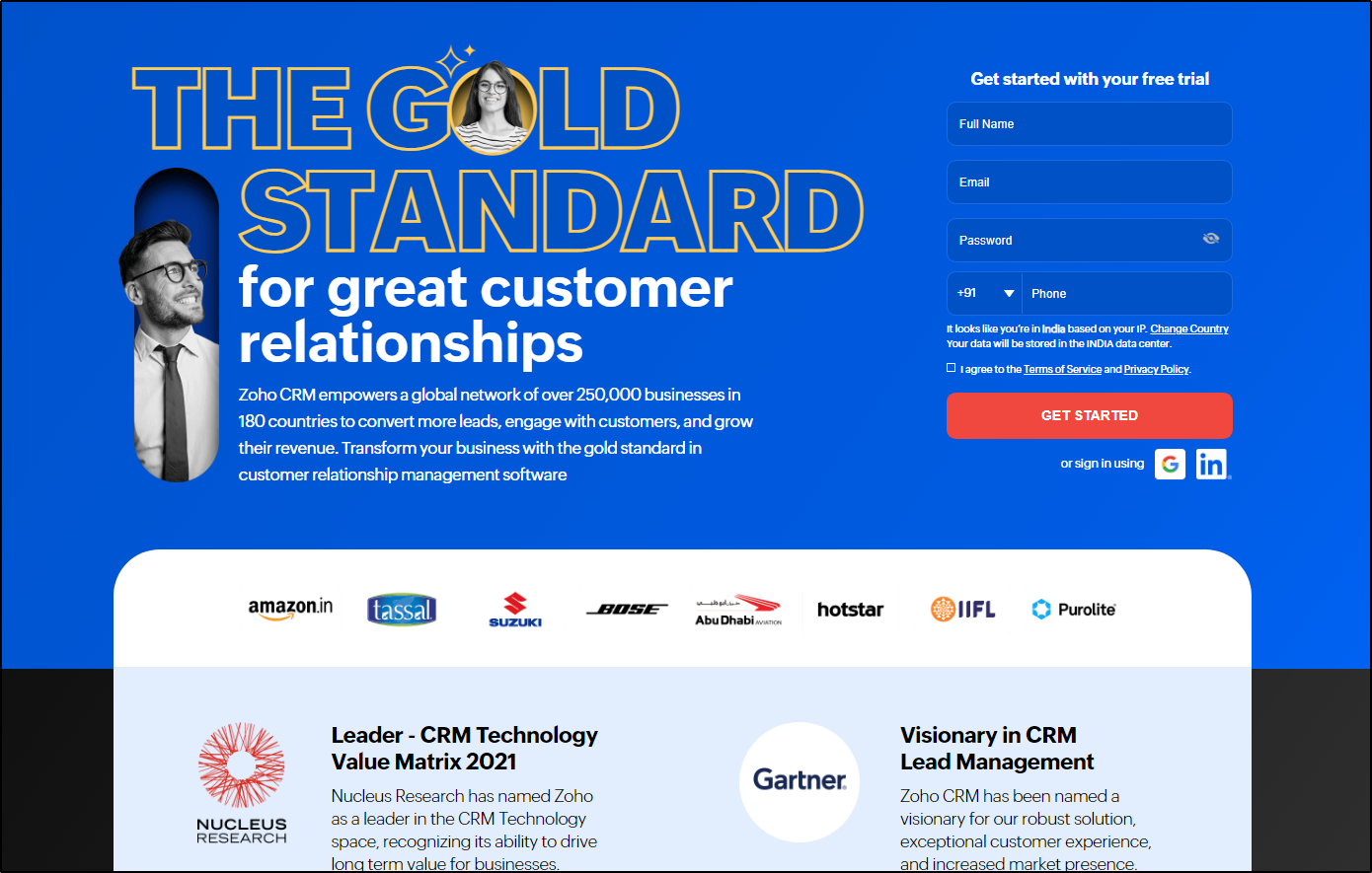
Zoho highlights their noteworthy customers and awards/media mentions front and center. This trend won’t be going away anytime soon—36% of the top landing pages include some form of social proof. Testimonials, customer stories, and badges scream “Trustworthy!” to your customers.
Take action: Social proof isn’t synonymous with a testimonial. Add your best clients, awards, or badges to your page.
3. Unbounce
Unbounce’s CTA button tells users exactly what they’re signing up for—chatting with an agency specialist. Personalized CTAs perform 202 percent better than basic CTAs.

Something else to note is the smiling man. It’s no secret that happy people are friendlier than a piece of software. And if you follow the man’s gaze, your eyes end at Unbounce’s call to action. Coincidence? We don’t think so.
Take action: Try out different forms of CTA copy and A/B test to see which one converts most. You can try a GIF, a dynamic QR code, and more. You can also test your images and see if a smiling person works for your audience. As for directional cues, use images and design to point your audience to the CTA button.
4. FreshBooks
Sometimes you’ve got to let the numbers do the talking. FreshBooks grabs your attention with statistics like, “Save $7,000/year on accounting costs.” The average person would be happy to add $7k back into their pocket.

They also take a similar approach as Shopify and state how many business owners use FreshBooks—a whopping 24+ million. If over 20 million businesses are using FreshBooks AND it can save you thousands of dollars, why not try it for free?
Finally, do you see the small print under the CTA button, where it says “No credit card required. Cancel anytime.”? This incentive is gold! The most annoying part about trials is forgetting to cancel and then getting charged. FreshBooks gets rid of this pain point in six words.
Take action: Use statistics to target your audience’s desires, like boosting productivity, customer support, or increasing revenue. Hint hint… you can find these target desires using Breadcrumbs.
5. Loomly
This B2B landing page example is longer than the rest. Loomly starts minimally with a single field form and three-sentence hook: “Free 15-day trial, no credit card required, no obligation.”

They also answer the user’s biggest question—Will Loomly work with my social media channels?—with a list of integrations below.
Take action: You don’t have to describe everything with words. Images, icons, and videos can support your messaging.
Moving onto below the fold, video explainers are all the craze—94% of video marketers say video has helped increase user understanding of their product or service.
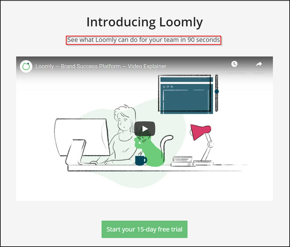
Of course, users don’t want to spend all their time watching your video. Loomly knows this and adds, “See what Loomly can do for your team in 90 seconds.”
Loomly also adds a neatly-designed chart to compare their features with their competitors. This trick wipes away the urge to leave Loomly’s page and research their competitors.
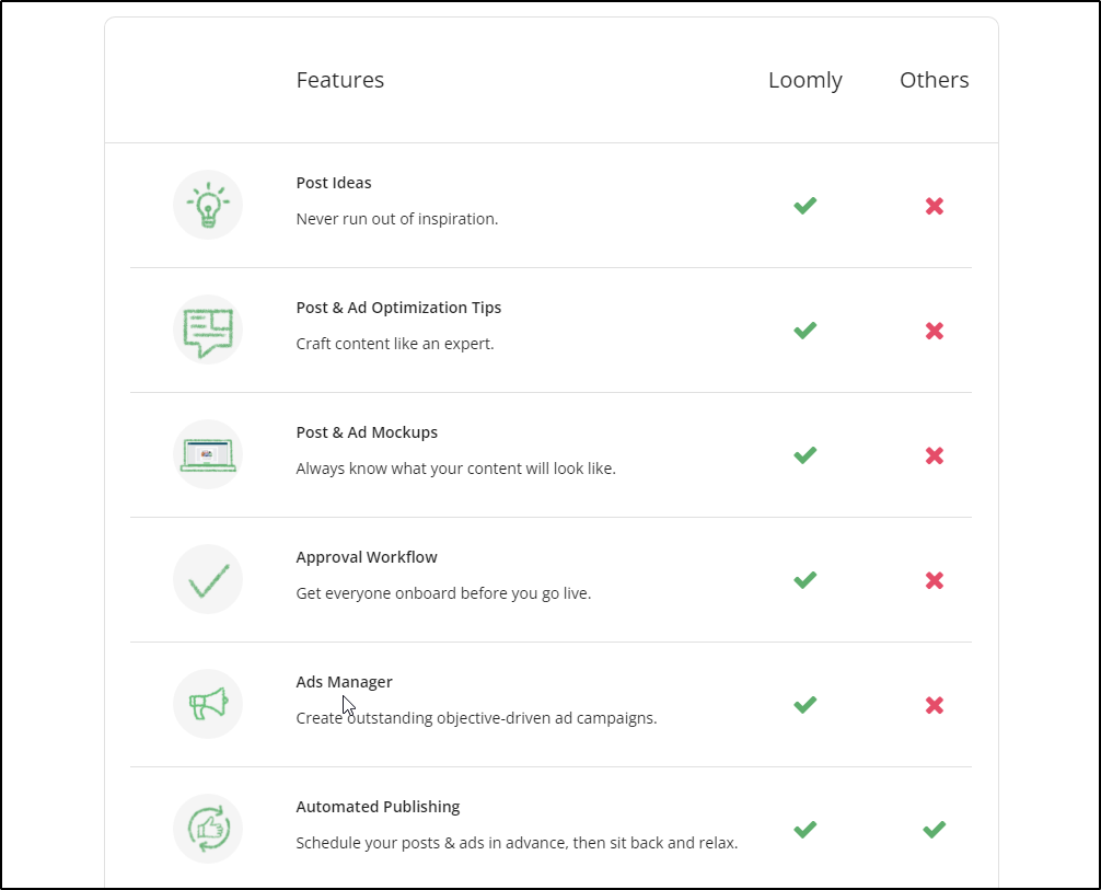
Take action: Want to add a video explainer to your landing page? Keep it short. A minute or less is the sweet spot.
As for your competitors, do the research for your customers and list what makes you stand out. It’s even better if you add the competitors’ names to the chart.
6. Oribi
What stands out the most about Oribi‘s landing page is their bold humor. Anyone who uses Google Analytics knows it’s a pain. Oribi plays along with this pain point and adds funny GIFs to lighten the mood.
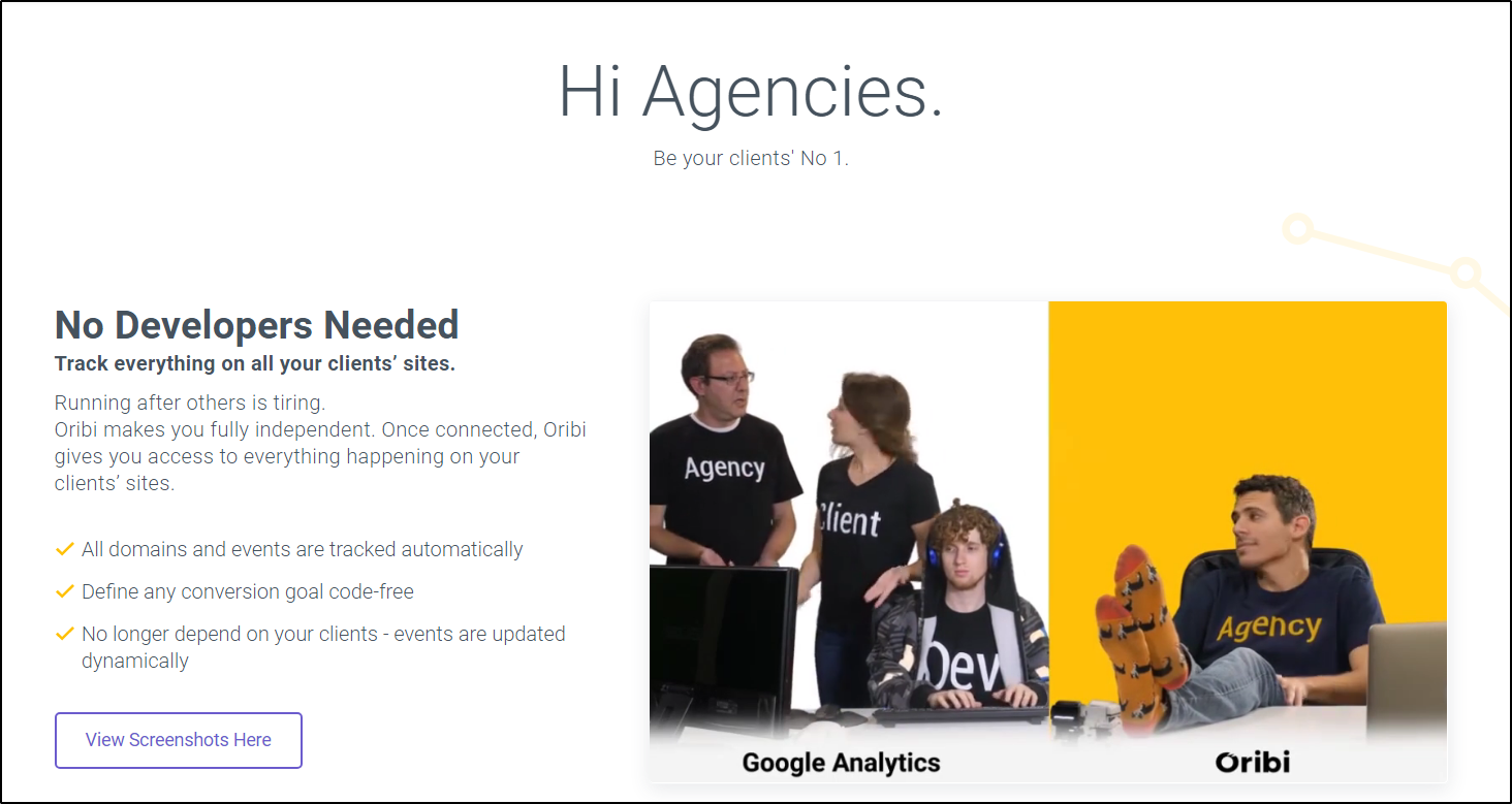
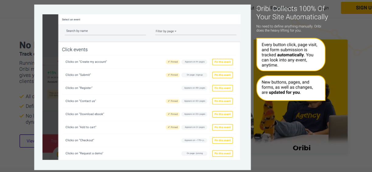
Oribi also stands out with a “View Screenshots Here” option. Click this button, and Oribi will show you screenshots of their software. This option declutters their landing page and directs users to the goal: Signing up for Oribi.
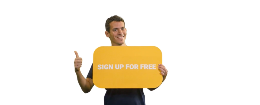
And we can’t leave this landing page example without discussing their witty CTA. You can’t tell in this screenshot, but Oribi’s CTA is a GIF of the founder holding a “Sign up” button. Adding a friendly face to the call to action helps encourage visitors to sign up.
Take action: Advertising to B2B buyers doesn’t have to be cut and dry. B2B businesses like personality, too! Capture emotion and add some humor, empathy, or happiness to your landing page.
7. Zoho Campaigns
Zoho Campaigns shows you how an all-text landing page is done, using white space, bullet points, and headings to separate their copy into three distinct sections. It’s easy to digest from top to bottom.

The best part about Zoho’s landing page is the form field. Sure, they’re asking for quite a few pieces of information, but the email address is the only mandatory field. This is a great way to collect more info without being pushy.
Take action: If your audience does better with all-text pages, use headings, bullet points, and white space for an easy-to-read experience.
And if you’re interested in collecting more contact information, copy Zoho’s trick and only make up to three fields mandatory.
8. Intercom
Intercom’s landing page uses wit to grab visitors’ attention. Their headline, “It’s a win-win,” captures Intercom’s solutions of happier customers (the left) and more efficient teams (the right).
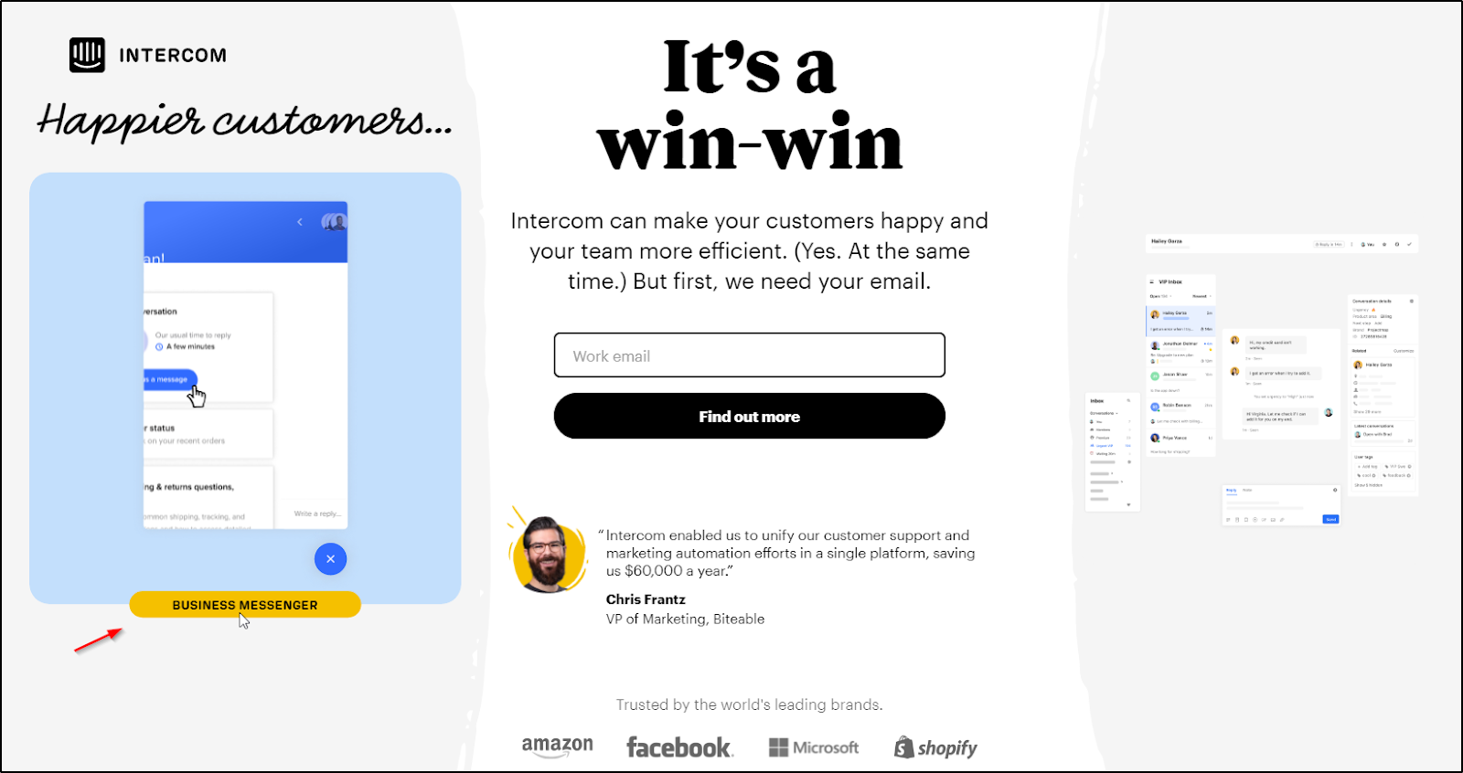
The left side says “Happier customers.”
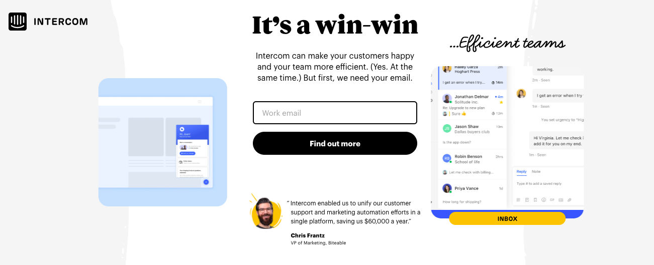
The right side says “Efficient teams.”
Each side shows an interactive GIF of what Intercom can do for both customers and teams… it’s truly a win-win.
And we can’t deny Intercom’s beautiful landing page design. Don’t skimp out on design—most buyers admit to judging a brand’s design before making a purchase.
Take action: Interactive content can help you target more than one desire on a landing page. Play around with videos or GIFs and see what works best for your audience. And use your brand colors to enhance your landing page design.
-

7 Strategies to Use Promotional Products to Enhance Brand Loyalty
Read more: 7 Strategies to Use Promotional Products to Enhance Brand LoyaltyEverybody loves getting free stuff, especially when it is a pleasant surprise. What if you…
-

Why B2B Brands Need to Invest in Influencer Marketing
Read more: Why B2B Brands Need to Invest in Influencer MarketingHere’s something that might blow your mind: The global creator economy market is projected to…
-

Top 10 Reasons Why SaaS Adoption Is Growing
Read more: Top 10 Reasons Why SaaS Adoption Is GrowingThe adoption of Software as a Service (SaaS) is rapidly growing across industries, reshaping how…


Final Thoughts
Analyzing landing pages gets ideas flowing, but you won’t know what works until you test it out yourself. Test your landing page design and features, one by one, until you get it right.
B2B landing pages are a vital component of your lead generation process. However, landing pages aren’t the only thing you need in your lead generation cycle. You should also have a contact scoring system in place to ensure the most relevant and highest-value leads are moved along the pipeline.
Sign up for a free demo of Breadcrumbs and see how contact scoring can turn leads into loyal customers.