Landing pages are so important. This is often the first experience a visitor has with your brand, so making a good impression is important for building brand awareness, educating your audience, and, most of all, encouraging visitors to convert. Because, after all, the goal of any landing page is to get conversions.
1. Make your landing pages simple
Your landing pages need to be simple.
While this may sound like a no-brainer, it can be difficult for anyone who is attached to their landing page design or copy to see they have over complicated things. The main goal of your landing page is to direct your customers to your call to action. That means the less visual clutter to have on your pages, the better.
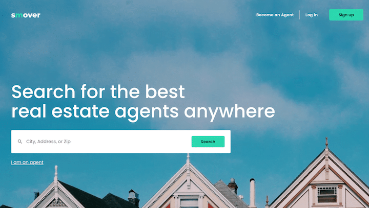
Take a look at this example of a startup landing page:

The design of this page is simple but effective, and that makes the goal clear. This landing page wants users to use the search function, but it also offers a way to get contact or move forward in the upper right-hand corner without overpowering the primary CTA. This leads us right to the next landing page optimization.
2. Keep call-to-action buttons straightforward
We know it can be fun to play on words and actions that relate to your business. Afterall, everyone wants to stand out from the competition. But there is a reason you see so many businesses with buttons like “Download Now,” “Join Today,” “Order Now,” and “Try For Free.”
These standby phrases just work.
Sometimes, it is better not to reinvent the wheel if you want to maximize conversions.
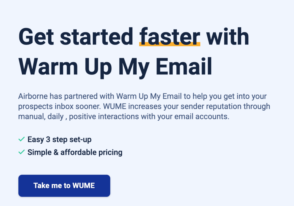
The best way to make your CTAs more targeted is to communicate value within this familiar framework. Take this example from Airborne’s Warm Up My Email tool:

The CTA gets specific. Instead of “Get Started Now” or even “Sign Up,” this CTA uses first person and the abbreviated name of the tool. This invites the user in more effectively without straying too far from familiar CTAs.
3. Prioritize important info above the fold
When we refer to “above the fold,” we mean that everything can be seen on your webpage before your user needs to scroll. (This phrase can be confusing because it was originally used for newspapers, which you actually fold, instead of websites, where you just scroll.)
Information that is in the top area of your landing page is what your visitors will see right away. There’s no guarantee they see anything else. Website visitors take less than a second to form an opinion of the page, and if the opinion isn’t favorable, they’re likely exiting.
So if you keep the important information at the bottom of the page, you may miss out on leads that bounce out because your landing page didn’t entice them enough.
The solution is to prioritize your important information above the fold on both mobile and desktop versions of your landing page. Check to see out how the information reads on several different devices before publishing it. Otherwise, you may accidentally place some of the most pertinent information below the fold.
4. Share your offer clearly
Remember how visitors are forming an opinion of your page in 1 second? That means there should be no confusion about what the desired action of the landing page is.
If you are giving 10% off, make that clear. If you are promoting a webinar, registration should be a no-brainer. If you are selling a 5-day workshop, there should be no question. If you just want an email? Still needs to be crystal clear.

Your landing page’s headline should immediately spell out your offer. Subsequent subheadings and any copy on the page should explain the benefits of your offer.
As you drive leads to your CTA buttons, you should keep your description of the offer clear and concise. If you begin to stray away from the main point of your offer, you could lose visitors before they complete your CTA—which means your business is losing out on leads.
5. Focus on your copy
Your landing page design is important, but so is your landing page copy. Focus on getting this copy to be more effective for your audience.
Test out scarcity marketing tactics in your copy. If you offer products, the word “limited” or “exclusive” can be a great way to optimize your landing page without overhauling it. People can’t help but respond to this.

For instance, when your leads want a certain product that you offer, they are more inclined to wait to make the purchase if they know you have plenty left for them to purchase. However, if you let them know there are “limited quantities available” or the product is “only available for a limited time,” they will be more likely to add the product to their cart.
Just be sure to avoid common copywriting mistakes, like using too much jargon or focusing on features instead of benefits.
6. Test exit pop-ups
Adding an exit pop-up can help retain more leads before they bounce out of your landing page. Now, pop-ups are a landing page optimization that can be divisive, but an exit pop-up is not as annoying or intrusive as a pop-up that appears as soon as a visitor lands on your page or in the middle of scrolling.
Instead, this type of pop-up allows you to have one more chance to encourage your visitor to convert.
The best thing to do is A/B test this first to make sure it works for your audience. In fact, we’d recommend A/B testing most changes including pop-up design, location, and options, that you’re making to your landing pages.
We found that landing pages without A/B tests have an average conversion rate of 1.7%, while landing pages running tests have a conversion rate of 2.6%. Converting 50% more visitors could be huge for your business.
7. Include your contact information
This one is simple but important: Put your contact information on your landing page.
Even if you have a perfect landing page that is built to convert, you may still have visitors that are not quite through the decision phase in their buyer’s journey. One of the best ways to ensure you can convert these leads if by having your contact information visible. Here’s an example from Chewy:

If customers have questions, they know how to call, how to chat, and how to email Chewy—and they know it without digging for the information.
Use a similar approach on your landing pages to build trust with your visitors. Plus, once you have people on a call or in your inbox, you can further nurture them through their buyer’s journey.
8. Showcase your best testimonials
At the end of the day, people trust others more than they trust a company. This makes sense—we’re more likely to trust a product or service our best friend or neighbor already uses because we know there’s someone already getting value.
You can use past reviews or ask for testimonials from your loyal customers. If you are asking for testimonials, let the person know what you will be using the testimonial for on your landing page. This will help them craft and create a testimonial that is effective while remaining truthful.
When possible, try to include more than just a simple testimonial. By adding a headshot and name, you instantly add more value to what is being said. This is because the leads reading these testimonials can visualize who said kind words about your company rather than just reading words on a page.
Try these landing page optimizations
You spend time setting up engaging landing pages, so make sure you’re getting the most out of them. Use these landing page optimizations to improve your design and your experience so that you can start converting more visitors.
Zach Rego is the VP of Sales & Marketing at Unstack, the no-code platform built for marketers. He hosts the Zero to a Million podcast, where he interviews founders, investors, and marketers about the strategies they used to build their business and their brand. Connect with him on LinkedIn or follow him on Twitter.


