Pricing can make or break a company and it’s a key component of revenue acceleration. Yet is often one of the most neglected things in the strategy of most SaaS businesses.
Let’s be honest. Most startups define their pricing mainly by looking at what their competitors are charging and making slight adjustments. Even less focus is usually dedicated to pricing pages.
Let me share a secret with you. Back in my time at AdEspresso, two of the biggest revenue growth drivers were:
- Improvements to our pricing strategy
- Improvements to our pricing page design
Adjusting our strategy and pricing plans drastically increased our average lifetime value.
Adjusting the design of our pricing page was even more impactful, increasing the conversion rate of website visitors and moving more users to annual plans rather than monthly.
So, if, like most SaaS companies you’ve neglected your pricing page design for a long time, look no further. Today I’ll share with you my personal collection of the 18 best pricing page examples I’ve gathered over the last 5 years.
You know the old saying: “Good artists copy, great artists steal.”
Well, the best time to update your pricing page design was yesterday. The second best time is NOW.
Check out these amazing SaaS pricing page examples with my personal comments on what makes them great, and get immediately to the drawing board to think how you too can make your pricing page a money-making machine.
Plan-based pricing page examples
Most SaaS businesses design their pricing strategy around plans.
It’s one of the most simple ways to price your software and is usually the easiest way to help your potential customers understand how much they’ll spend.
Simplicity in pricing plans is an important best practice. The harder it is for your users to understand which plan to choose and how much it will cost, the harder it will be to convert visitors into paying customers.
1. MarketMuse

MarketMuse is a great SEO tool and has a great pricing page.
First of all, I find the design nice and in line with their brand. Too bad they have some text alignment error in a box in the middle of the page. I’m sure they’ll fix it soon.
They display pricing options from the most expensive to the cheapest one. Usually, this is something very effective to make the basic plans look cheaper.
Another great idea on this pricing page is the configurator, where potential customers can specify their needs and get a recommendation of the best plan to buy.
I just found the call to action in the premium plan a bit confusing. When clicked, it opens another 3 options.
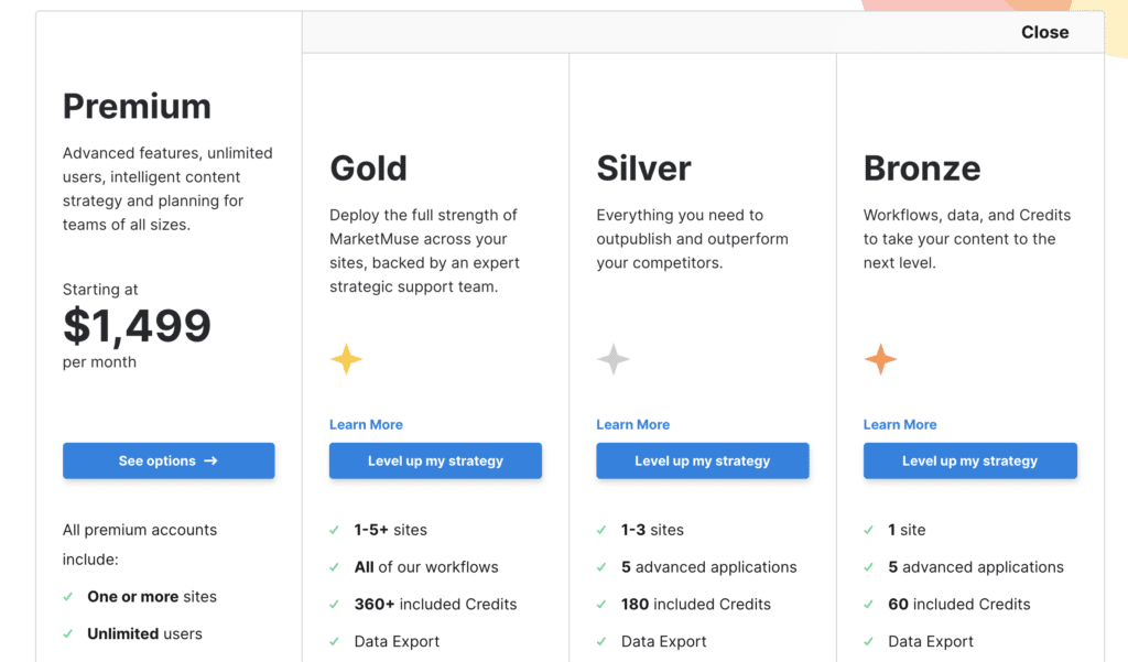
Too many options usually make the buying decision harder and could confuse a potential customer.
2. Sortly
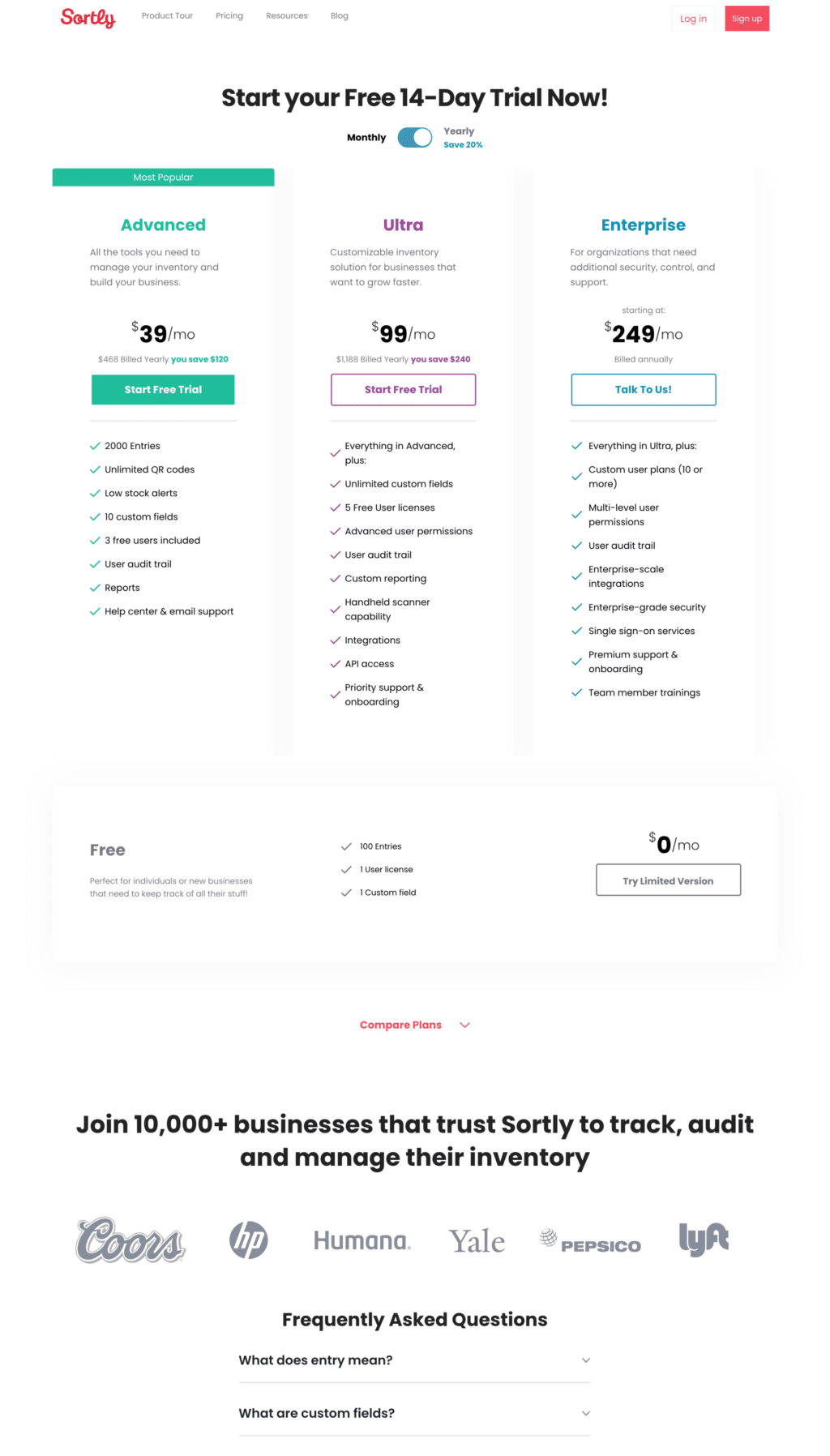
Inventory management app Sortly has a pricing page with a minimal design that goes straight to the point.
I like the simplicity of the page; it always helps convert more users to paid customers. Yet, I would add some extra elements to reflect the brand identity more.
Having only three plans is a great choice and what’s included in every plan is clearly described.
I like how they highlight the amount of the discount when picking a yearly subscription.
Many SaaS tools don’t show the starting price for enterprise plans; this is delegated to the sales process. I love the Sortly approach to show that the enterprise plan starts at $249/mo. It’s a price low enough to be appealing.
Sortly adopts a freemium model, and I love the idea of keeping the free plan aside from the paid plans. It gives it less visibility, letting users focus on the plans that provide the best value and maximize the company’s potential revenue.
3. SparkToro
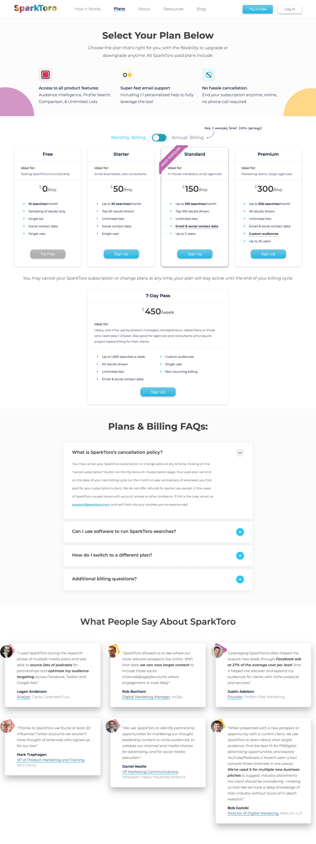
Rand Fishkin’s new company, SparkToro, has a great pricing page.
It’s simple but highly on-brand, and overall you can tell from the small details that it favors transparency over conversion rate.
The Free tier is shown first, the default billing option is monthly (but they have a nice design to highlight the advantages of going annual), and for those that don’t want a long term commitment, they also have a 7-day pass, a pricing option I’ve not seen on any other of these SaaS pricing page examples.
Another nice element of this page is the header. It does a great job highlighting what users can expect: All features in every plan, super fast support, and no-hassle cancellation. I think everyone will love it.
4. Buffer
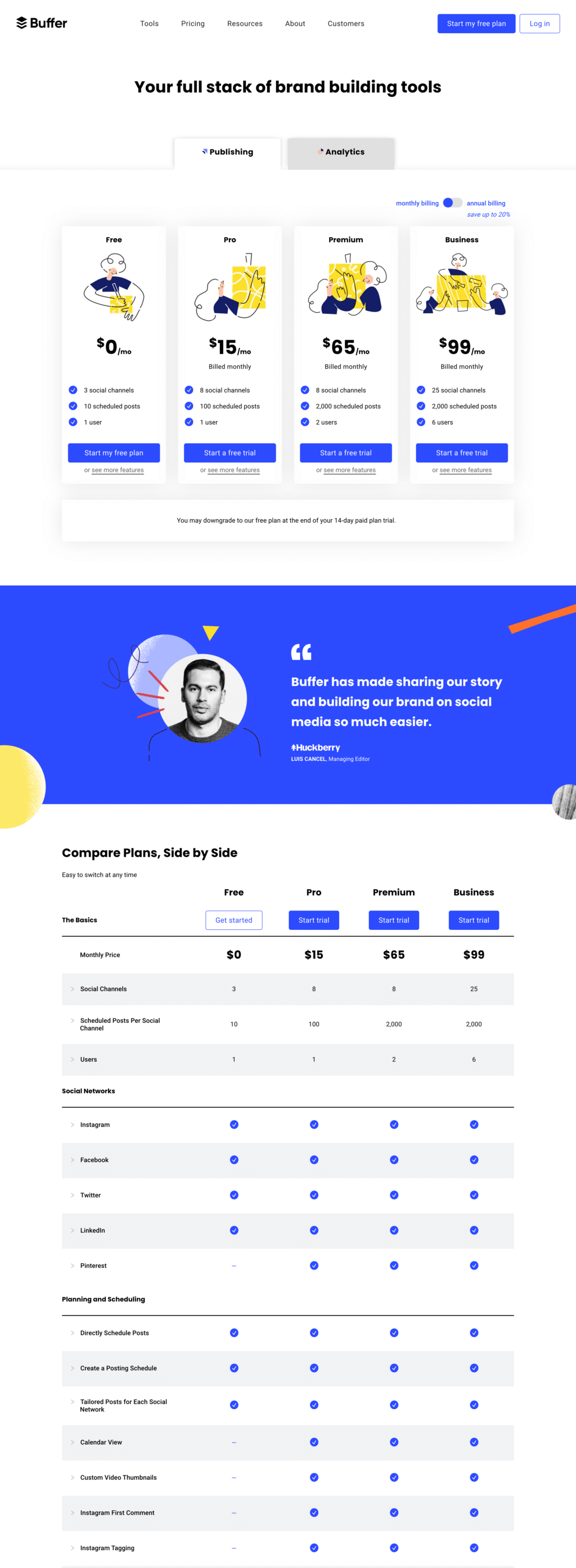
Let’s check the pricing page of an iconic social media tool, Buffer.
There are pros and cons on this page. I like the design, the clarity, and the bird-eye view of what each plan has to offer before the usual, endless list of features available in each plan. The illustrations are a nice touch to differentiate each subscription plan.
I find the intro of the page “Your full stack of brand building tools” a bit buzzwordy and not too descriptive of the value proposition. It also sounds like I’m buying a set of tools instead of a unified platform.
Another thing I don’t like is the split between publishing and analytics. It makes pricing more complex, and I’m not sure what to do if I need everything.
The social proof box is a nice touch with a great design and a strong, to the point, testimonial. It actually does a better job in describing Buffer’s USP than their page title!
5. The New Yorker
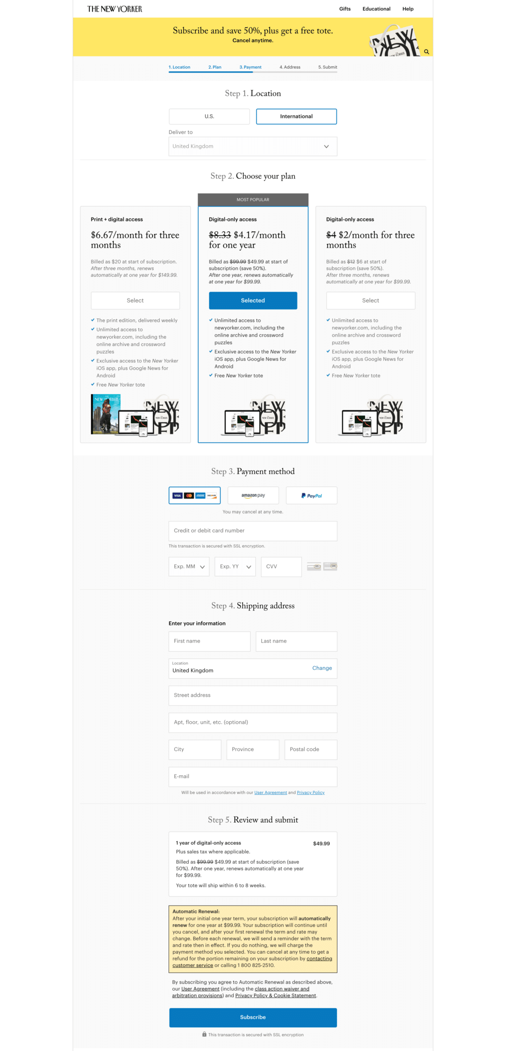
Enough with Saas pricing pages. Let’s see how one of the most famous magazines designed its pricing page—The New Yorker.
I have to admit I’m quite puzzled by this page. Is this a pricing page or a landing page? Both.
For an offer as simple as this, I don’t dislike having the pricing and signup form on the same page. I also like the clean header and navigation bar with most distractions taken away.
What I really don’t understand here is the pricing strategy. It’s the opposite of what most startups do.
The digital-only plan for 3 months has a monthly cost of $2 versus the $4.17 of the yearly plan. Shouldn’t they push more people to the yearly plan? That’s the one you would imagine to be heavily discounted.
After reading everything carefully, it’s clear that every plan automatically renews at full price at the end of the purchased period (3 months or a year), which is higher than what is displayed in the boxes. It’s $99.9 per year.
I am confused and for sure this strange pricing distracted me a lot from finalizing the purchase.
Honestly, I think where they make money is the full price renewal. And even if the design tells me that the most popular plan is the yearly one, what’s really happening here is that with the $2/mo pricing tier, they’re trying to push me there so they’ll get the full price renewal sooner.
It’s like a paid trial for 3 months.
I really don’t know if this is crazy or genius but for sure it was a pricing page example worth mentioning!

Ebook
18 Stunning Pricing Page Examples
Get inspired by these 18 stunning pricing page examples and make your pricing page a money-making machine.
Feature and usage-based pricing pages
As tools grow bigger and more sophisticated, many SaaS companies decide to go this route. On top of the standard pricing plans, they also add a usage component to the pricing.
What I love about this category is the flexibility it grants to users. Non-sophisticated users with high volumes can stay in the lower plan but still get high volumes. Sophisticated users can pay for a more feature-rich plan without paying for high usage volumes.
6. Mailchimp
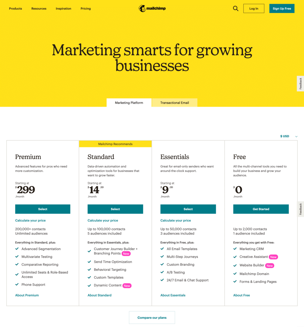
I love the Mailchimp pricing page. It’s clean and very smart. You easily guess they’ve gone through many iterations and a/b tests to get here.
The design is clean; they let you switch the currency to understand your actual monthly cost. They highlight each plan’s benefits clearly without neverending and boring feature tables (which are still available by clicking on “compare plans” if you really want them.)
But the real takeaway from this page, in my opinion, is how they order subscription plans. Most pricing pages start with the cheapest (or free) one and then move to the most expensive.
The problem with this approach is that the first price users see is the lowest one. This creates an anchoring effect that makes everything else expensive.
Mailchimp uses anchoring to their advantage.
The first price you see is the most expensive, $299. Once your brain is anchored to that price, the next plan at $14.99 looks like a steal! And that’s exactly what they want you to buy.
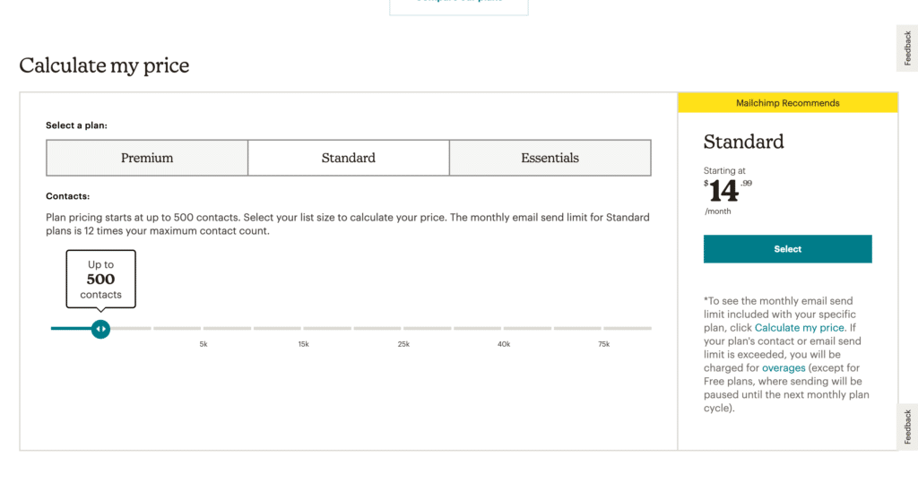
Once you’ve selected a plan, you can then use a classic slider to determine how many users you’ll send emails to. This is the revenue booster. Most users in the standard plan will need more than 500 contacts, and their price will quickly scale up, generating more revenue for Mailchimp.
Bravo! This is likely the most well-designed pricing page in the market.
7. OneFleet
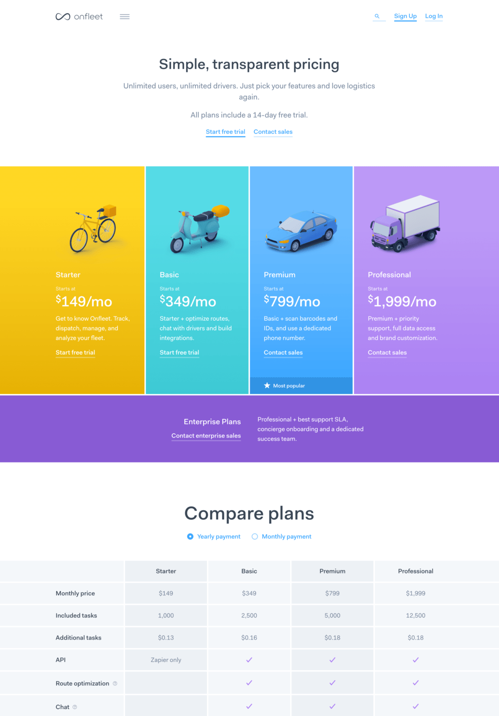
Logistics is boring! Yet, the OneFleet pricing page is not. It has a great design. Clean and straight to the point.
It starts with a very appealing and concise pricing table that focuses only on the real differentiation between the 4 subscription plans.
It then goes more in-depth with a long (maybe too long) feature comparison. This is also where you discover that the prices shown above are for the yearly plan.
Take notes here. Cash flow is king, and all the best SaaS pricing pages nowadays are set to default to a yearly plan.
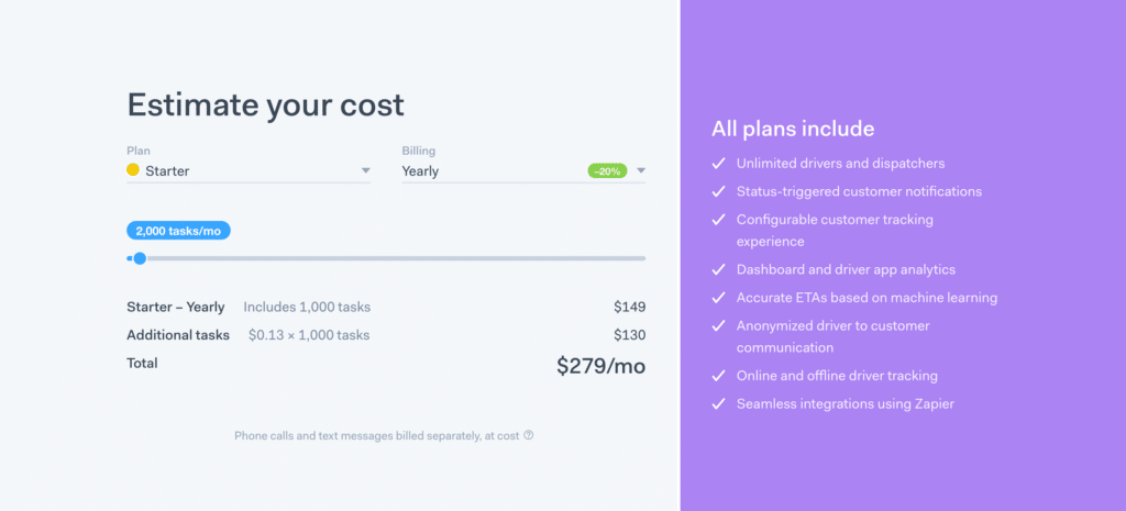
Finally, we get to the usage part of their pricing strategy. Here you can adjust the selected pricing plan to your usage needs. This box is clean and simple to use. Thumbs up.
8. Zapier
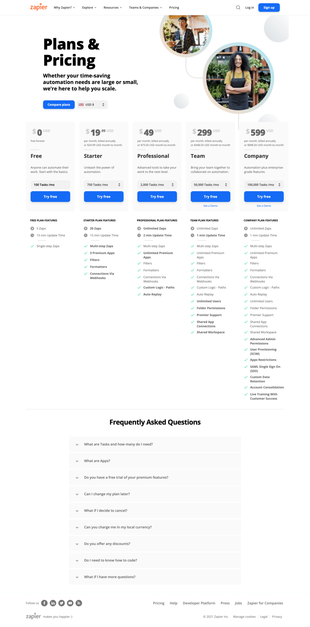
Zapier takes a different approach to usage-based pricing page design.
Instead of two different boxes, one with the pricing tiers and one with a slider to select usage, they keep all together with a dropdown.
I’m not sure which approach I like the best. OneFleet, in my opinion, is better from a design standpoint, but Zapier is more compact and could be easier to understand for users.
And usually, simplicity always equals higher conversion rates.
Another unique take on pricing pages here is the choice to remove the monthly/yearly switch. All the prices shown refer to the annual subscription. I have to admit I missed this detail the first time I saw the page.
Finally, I have a big question mark on the images used on this page. Both pictures make me think of brick-and-mortar stores. I’m not sure they represent the best potential customers for Zapier.
9. ConvertKit
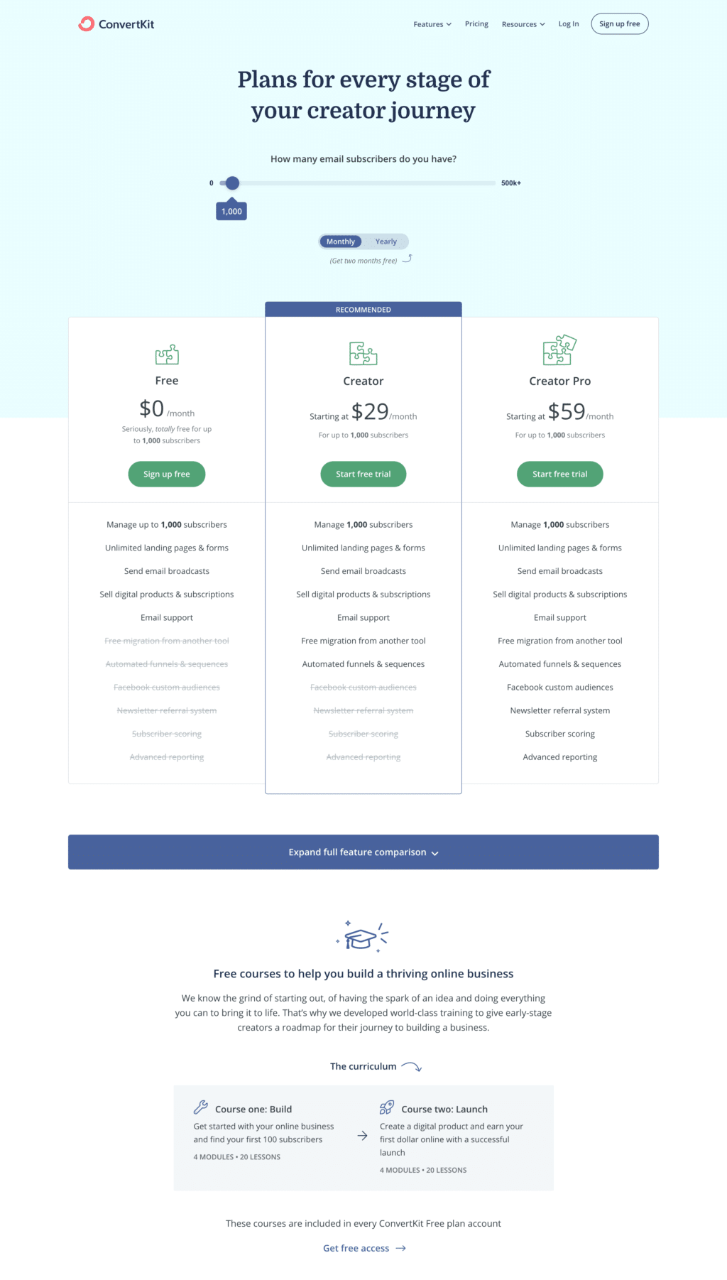
ConvertKit is a popular marketing automation platform. I’m not in love with the design of their pricing page, but I have to admit it’s minimal and simple to understand.
Compared to the other players, they choose to put the slider to configure usage-based pricing on top of everything. It’s a great way to offer potential customers transparent pricing.
Another great element for transparency is the well visible switch between monthly and yearly subscriptions. Here I would highlight more the discount if you go yearly.
This SaaS pricing page has an interesting approach to features included in each plan. They list the same features in every plan but rule out those not included.
Psychologically, we are usually impacted more by losses than by gains. Highlighting what you are losing by not going with a more expensive plan is an interesting choice that could move the needle.
Finally, I think education is a key component of each Saas business. I love that, on their pricing page, they’re highlighting the marketing courses included with the software.
10. Ahrefs

To close these pricing page examples of companies adopting a usage and plan-based pricing strategy, I wanted to show you Ahrefs, one of the most well-known SEO tools.
This is likely the most complex of the pricing tables we’ve seen so far.
This kind of pricing page maximizes the flexibility for users. You can basically build your subscription plan as you want. Ahrefs has multiple usage limits, and you can customize all of them.
Need more users? It’s $30 per user. Need more projects? $10 per project. Need more site crawls? It’s $50 for 500,000 pages crawled.
As a sophisticated user and a customer, I love the flexibility. On the other side, I think it makes the pricing page quite complex to understand.
The switch between monthly billing and annual is huge, right above the pricing table. But it doesn’t have any design clue to make me understand that I can click on it to switch between annual and monthly.
One great example of how you can be creative with your pricing strategies is the $7 trial. Everyone nowadays is used to free trials. Ahrefs takes a counter-intuitive approach and requires a small payment to get on the trial.
I think it’s the right choice for them. Given the kind of tool they offer, I guess a lot of people would abuse the free trial jumping on and off as needed without paying.
Having a paid trial likely reduces the conversion rate slightly but for sure increases the trial to paid conversion (because you already have the credit card and validated it with a small charge).
It also reduces fraud. You can create as many emails as you want, but you can’t create as many credit cards as you want.
They use huge testimonials, which is a brilliant design, in my opinion, and they also reinforce trust by showcasing the logos of their customers at the end of the page. This is rule no.1 of pricing page best practices.
Seat-based pricing page examples
Seat-based pricing is prevalent among more enterprise-oriented SaaS businesses (like Jira) or tools with little feature differentiation but an extensive adoption within the customer’s organization (like Slack).
Let’s see what are the best pricing page examples for seat-based pricing!
11. Notion
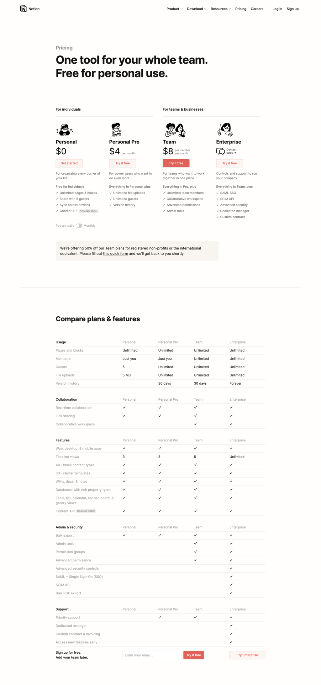
Personal and business productivity tool Notion has a very simple pricing page.
Like most of the tools that aim to have millions of users, they have a freemium pricing model, and they split their pricing page between personal and business use.
The feature differentiation is quite limited among the 4 pricing tiers. What’s really driving Notion’s revenue are businesses adopting it company-wide with hundreds of users.
When it comes to building trust using social proof, Notion has the smartest approach of all the SaaS pricing page examples we’ve seen so far. They directly embed tweets from customers praising the app.
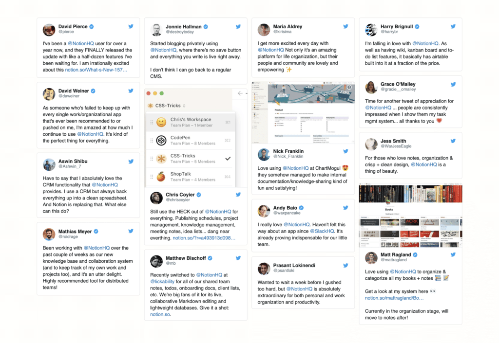
I find this approach great. I always wonder if quotes on landing pages are real or made up. Embedding tweets really build an incredible level of trust.
12. Jira
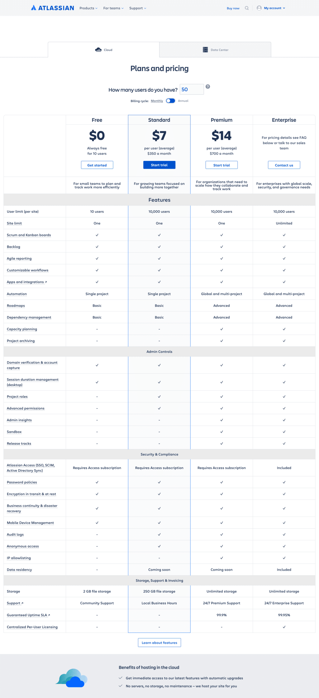
You could argue that project management tools are boring…well, their pricing pages are also boring. At least that’s been my first reaction to Jira’s pricing page.
It’s a huge table with all the pricing options but really no personality.
The one thing I like about their approach is the option to insert the number of users you need. This way, you immediately get accurate pricing information for each plan without firing up your calculator app.
Oddly enough, Jira doesn’t have any form of social proof on the pricing page. This is likely because they are market leaders and don’t need it.
Overall, I would not consider it one of the most successful pricing pages I’ve seen.
13. Slack
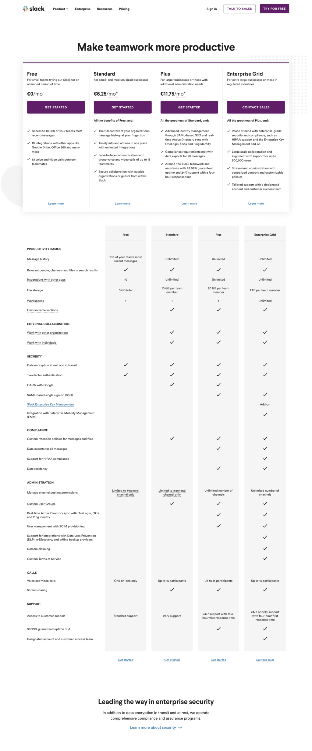
The Slack pricing page is clean but pretty much standard.
I think they do an excellent job at matching every pricing plan with a buyer persona, and the free plan is attractive enough for most users to start playing with it.
Like most entries in this category, the main differentiation between pricing tiers revolves around user management and permissions, which is a great way to maximize profit from enterprises.
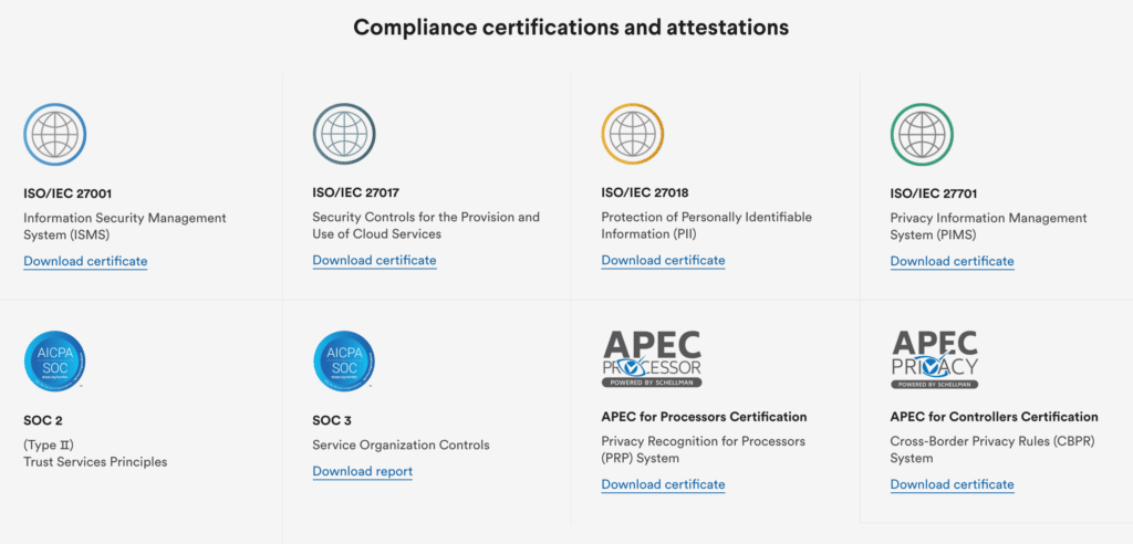
Given you’ll be running most of your business communications over Slack, security is clearly a big selling point. That’s why they have a big box linking to a page with all their certifications.
14. Fellow
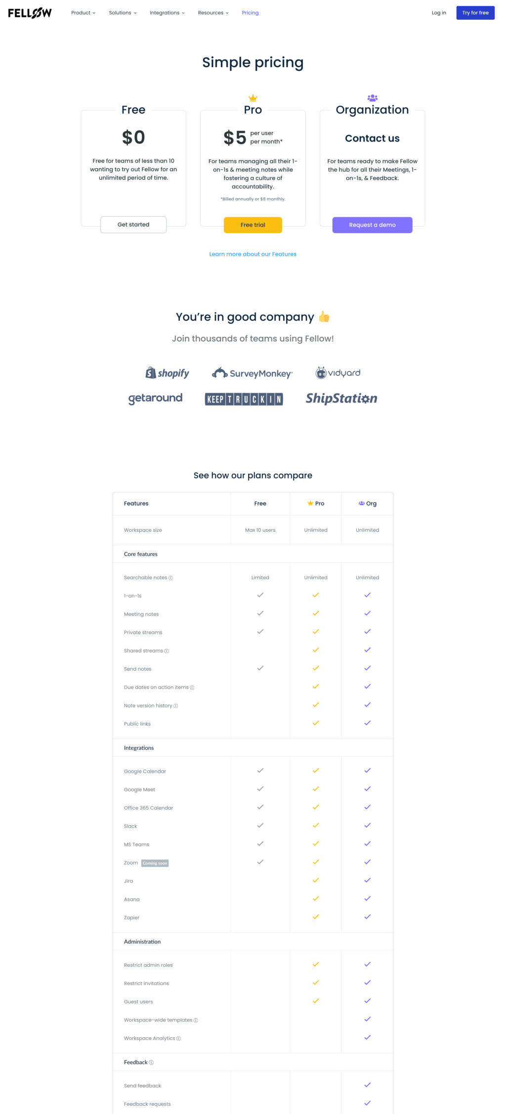
Well, the Fellow pricing page holds true to its claims: Simple pricing.
And what I like the most about their page is the simplicity: three tiers, effectively described without the usual endless list of features (which is still available below the fold) and some social proof with big customer names. The pricing plan they want you to select is highlighted with a crown to make it stand out.
The only thing I would improve on their page is reinforcing the unique value proposition of their product. There’s really no mention of what I’m buying on this page.
15. Booksy
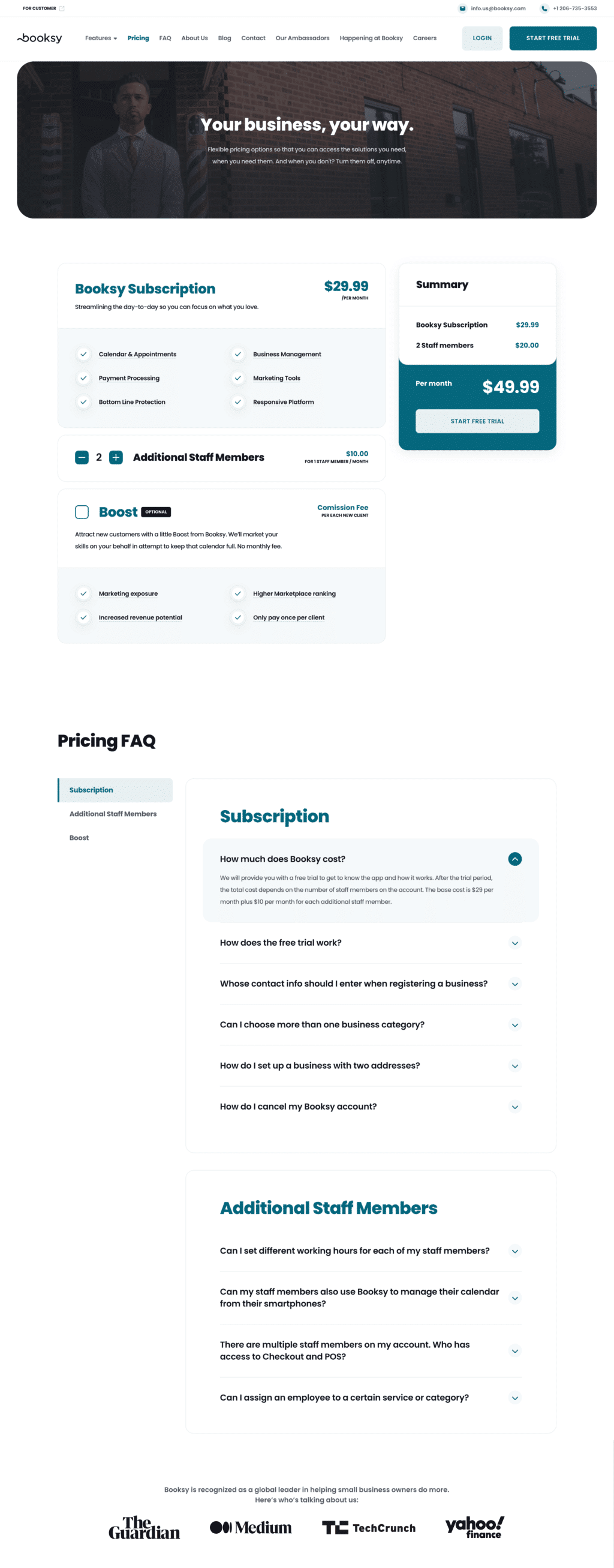
Let’s close this roundup of SaaS businesses adopting a usage-based pricing strategy with Booksy, a booking app for hairstylists.
The approach here is a little different from the other pricing pages we’ve seen so far. Booksy has a single pricing tier at $29.99 which includes all the features. Every extra user is charged $10.
There’s no free version of the product but a trial is available and they have an extra feature to boost your bookings which is billed as a commission fee on every booking. I think it’s a great idea for their buyer persona.
Small/medium businesses are scared of paying for advertising because they don’t know if it will be effective. Charging the extra promotion as a fee on every booking removes their fear and it’s a no-brainer.
Given the kind of business, they likely don’t have well-known companies as customers to be used for social proof. So they decided to use press mentions to inspire trust. Smart.
On the pricing page, there’s no way to contact sales. I get why. At such a low price point it’s tough to have a sales team. On the other side, SMBs often need some hand-holding and phone support.
Competitors comparison pricing page examples
We are entering the realm of the bolds and fearless. Directly calling out your competitors on your pricing page is not so widespread and requires an outstanding pricing page copy.
Let’s check out few pricing page examples of this approach!
16. FLG

There are some really interesting elements on FLG pricing page.
The first thing I’ve noticed is that even though their pricing is quite aggressive and in line with a self-service motion, they have no sign-up option. All call-to-action buttons are aimed at requesting a demo call.
Next, they don’t show the price above the fold but focus more on reinforcing the unique value proposition and creating social proof.
Only after all these elements can we see the pricing in a nice box that compares their £75 price point with the sum of all the tools they are replacing. I like it; £ 75 vs. £603 seems like a no-brainer.
What’s even more interesting is that you need to scroll even further to discover they actually have three pricing options, not just one. We have seen a lot of pricing pages where the company highlighted the most popular plan.
This is the first one where the premium plan is shown alone in a dedicated box.
Great job FLG!
PS: Since I wrote this article, they kept the page’s design more or less the same but removed the price comparison with their competitors.
17. GroundHogg

GroundHogg‘s pricing page is endless, and one of the most interesting I’ve seen so far in my pricing page examples review.
They are in a very competitive space, so clearly, they need to work harder to address potential buyers’ objections. The live chat popup at the bottom of the page reinforces this demand.
The most interesting element of this page is copywriting. It’s smart and clever. Evidently, they’ve done in-depth research on their buyer personas. Everything is focused on the concept of “Success tax” that their competitors are charging.
GroundHogg instead offers flat pricing that doesn’t go up as you become more successful and get more people on your mailing list. A way more effective pricing!
The comparison box is brilliant, with GroundHogg’s pricing always fixed at $40 and competitors’ pricing skyrocketing.
They’re even running an aggressive promotion to push more yearly subscriptions: pay 1 year get 2! Interesting idea, but in my mind, these aggressive deals are usually a flag that their churn rate might be very high.
Overall it’s a great example of copywriting and thinking out of the box. BUT I have to say this SaaS pricing page is also the most deceiving.
In their pricing information and comparison with competitors, it’s tough to understand that in order to send emails with GroundHogg, you’ll need to connect a service like AWS or Sendgrid to send emails.
The devil is in the details. They’re not removing the success tax. They’re just letting you pay it to someone else. If you factor in this cost, the price comparison will look way less shocking.
18. GoSquared
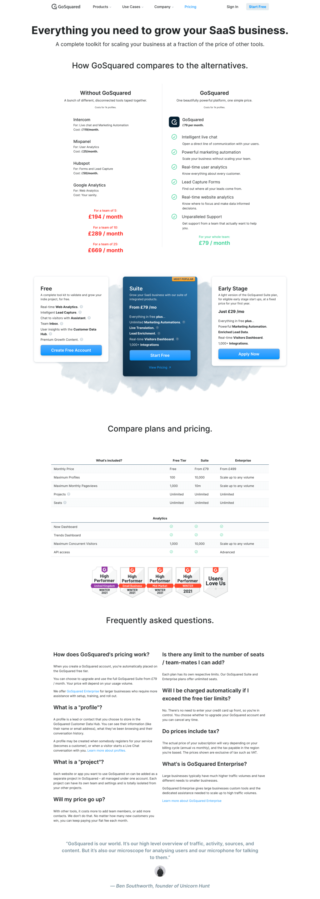
I’m starting to see a pattern. GoSquared, just like FLG, is priced in pounds. Could it be that UK-based companies are more likely to use comparison in their pricing pages?
This pricing page starts right away by comparing GoSquared pricing with a bunch of tools that it replaces. Of course, the comparison makes them look way cheaper, and it’s good to highlight that.
Still, I find the red and green colors they used in the design a real punch in the eye and is not in line with the brand personality.
The three subscription plans have three different call-to-action buttons, and this is confusing for me: “Create Free Account,” “Start Free,” and “Apply Now.” They make it harder to pick the right pricing option.
The most popular plan is well highlighted, but the link “View Pricing” is confusing. Isn’t this already the pricing page?
The list of key features is endless (I removed 90% of it from the screenshot.)
Right after that, we find the usual social proof with G2 badges. They are okay, but I would add some more social proof. Those badges are shown on almost every SaaS pricing page nowadays. I don’t find it really differentiating.
What’s the best pricing page example that inspires you?
We’re at the end of this round-up of the best pricing page examples I had in my collection. I could go on and on with another 50 pages… but honestly, I don’t think they would add a lot to the conversation.
Now it’s your turn. Which design inspired you the most? What best practices and revenue maximization tactics have you learned?
I’ll leave you with a final takeaway. Pricing optimization is not about getting things right at the first attempt.
It’s about having a rigorous process to make assumptions, test them quickly, measure the revenue impact and then move to the next experiment. Most of the time, you won’t move the needle too much. But when you’ll do, the revenue boost will be meaningful and long-lasting.
Let me know in the comments your favorite pricing page of this post and, of course, if I missed a page that should absolutely be listed here.


