
No matter what your goal is—shortening an enterprise sales cycle, identifying top-performing SDRs, or even a big picture goal like scaling revenue growth—you need to show your hard-won results in the quickest way possible.
This guide recommended five vital sales dashboards to get you started.
5 Sales Dashboard Examples to Extract Insights From Raw Data
Start with these five easy-to-understand sales dashboards to pinpoint your leaks and unlock revenue acceleration.
1. Sales conversion dashboard (marketing-aligned)
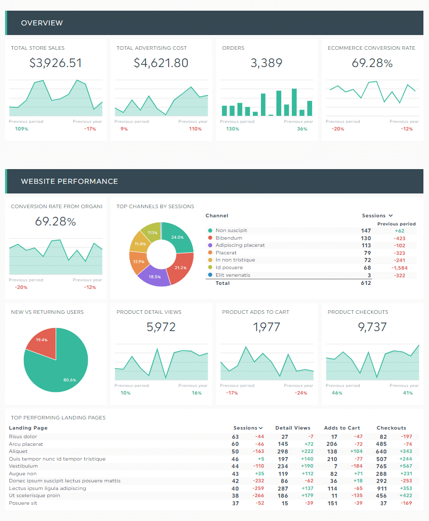
Metrics and KPIs you can use:
- Conversion rate
- Top performing landing pages
- Top channels by sessions
- Sales by campaign
- Leads by source
- Customer churn rate
- Loss rate
With marketing and sales often clashing on pipeline growth and KPIs, this sales conversion dashboard acts as a great starting point to get both teams aligned.
Misalignment occurs due to a myriad of reasons, such as culture (departments operating independently), poor cross-functional collaboration, and using a wrong or outdated ideal customer profile (ICP).
The last one is a biggie, because it’s the foundation of everything. Messaging, positioning, buyer-focused content, product, you name it.
Use a tool like Breadcrumbs Reveal to identify your most profitable customers. Analyze your entire marketing, sales, and product data in one place to highlight the attributes and actions that drive revenue today.
Here’s how it works:
- Connect your data source (e.g., HubSpot) with Breadcrumbs Reveal
- Select the customer segment that defines success (e.g., customers on pro annual plan)
- Reveal your results
You’ll end up with a dashboard like this. Note how it shows a detailed view of revenue-driven attributes. Right away, you know the specific industries the sales team should focus on.

Update your ICP accordingly to reflect your best customers today.
Share it widely with the marketing, sales, customer success teams. That way, every stakeholder can tailor their campaigns, content, and conversations to specific segments and generate conversions.
Breadcrumbs Reveal helps you understand what specific attributes and actions drive revenue. Grab your free account to build accurate ICPs and unlock revenue acceleration today.
2. Sales Performance Dashboard

Metrics and KPIs you can use:
- Number of new customers (or converted leads)
- Sales target
- Average weekly sales revenue
- Customer acquisition cost (CAC)
- Customer lifetime value (CLTV)
Look no further than the sales team performance dashboard* if you want to improve your sales operations, like supporting the frontline sales teams to sell more efficiently.
Top sales performers spend an average of six hours every week researching their prospects.
Customer research encompasses anywhere from connecting with buyers on social media to using business intelligence tools to fast track the sales process.
With a tool like Explore, you can quickly understand top contacts and their actions that drive conversions. Filter, sort, and click on any one of them for a high-level view.

Tailor your messages and contact method based on the contextual information above.
For example, a high-fit lead who repeatedly visits a “money page” is likely ready to buy or at the very least have a conversation about it. The SDR might reach out via a phone call instead of the standard email, since conversion rates are eight times greater in the first five minutes.
*Note that this dashboard differs from a sales leaderboard.
While the former shows the collective effort of an entire sales team, the latter evaluates how individual sales reps stack up against each other. Common metrics include daily activity and the number of product demos completed against targets.
3. Sales Cycle Length Dashboard

Metrics and KPIs used:
- Average sales cycle length
- Lead conversion rate
- Average length of sales stages
Enterprise sales cycles are often miscalculated
From duplicated closed won opportunities in Salesforce to departmental stakeholders with competing priorities, the enterprise sales cycle is, as Brian Gerrard, Sales Director at Outreach, puts it, “long AF.”
This dashboard gives you a bird’s-eye view of your average sales cycle length, digging deep into the different stages and managers.
Pair it with a contact scoring tool like Breadcrumbs to speed up your sales cycle.
Unlike most lead scoring systems that only identify sales-qualified leads (SQLs), you can use Breadcrumbs to unearth all qualified leads with insights into recency and frequency.
Marketing-quality leads (MQLs), SQLs, product-qualified leads (PQLs), or not, our co-dynamic tool helps you identify them all at all stages. You can also catch at-risk customers to improve customer retention.
For example, here’s how you might build a SQL scoring model:
- Connect your CRM with Breadcrumbs
- Determine what makes a SQL (e.g., logins every day in the past two weeks + invites users + integrates three or more third-party tools + visits pricing page three times within the past week)
- Activate the SQL scoring model
Sync these scores back into your CRM to build triggers, like routing sales-ready leads to specific sales rep (based on industry, territory, etc.) and sending alerts to your Slack channels to ensure no lead is missed.

Identify high-intent leads at the right time to speed up your sales cycle. Grab your free Breadcrumbs account today.
4. Sales KPI Dashboard (Individual)

Metrics and KPIs used:
- Opportunities created against target (or closed opportunities)
- Lead response time
- Average follow-up attempts
Expanding the sales team gets astronomical when companies start scaling, often doubling or more, according to Jordan Crawford, Founder of BlueprintGTM.com.
This individual sales KPI dashboard helps you see if your sales representatives are on track with their target and, more importantly, if there’s both scale and quality in the sales department.
Compare these individual sales reports to differentiate top performers from the pack.
Maybe it’s the rep who consistently prospects with main users, managers, and directors despite having a full pipeline.
Or the SDR who always hits at least 120% of quota.
Or maybe it’s the technical rep who knows the product extremely well and doesn’t need a product manager to jump in the demo to close the deal.
5. Sales Opportunity Dashboard

Metrics and KPIs used:
- Sales opportunities generated
- Average purchase value
- Units per transaction
- Sales opportunities by region/country
- Lead-to-opportunity ratio
- Opportunity-to-win ratio
This comprehensive sales opportunity dashboard identifies potential issues before it’s too late.
Unearth specific stages with bottlenecks and better understand where you stand at closing a deal.
For example, a sales manager might put the brakes after discovering a poor lead-to-opportunity ratio (note: this usually indicates you’re going after the wrong ICP).
Use this sales dashboard template to uncover hidden revenue opportunities. Adjust your sales strategies accordingly so you can allocate your resources to the most promising leads.
Create revenue-changing sales dashboards today
These five dashboards communicate your hard-won results visually, saving you time and effort to distill raw data into actionable customer insights.
Use them alongside your contact scoring efforts.
Grab your free Breadcrumbs account today to identify sales-ready leads, at-risk customers, and buyers with upsell potential—with zero guesswork.
-

7 Recruitment Strategies for Building a Top-Notch Sales Team
Read more: 7 Recruitment Strategies for Building a Top-Notch Sales TeamPicture this. It’s Q4 crunch time. Your numbers are slipping, quotas are starting to look…
-

Active Listening in Sales: How Listening More Can Close Bigger Deals
Read more: Active Listening in Sales: How Listening More Can Close Bigger DealsCraig Rosenberg, a renowned sales leader and expert, highlights the importance of active listening in…
-

12 Useful Sales Tips For Overcoming Customer Objections
Read more: 12 Useful Sales Tips For Overcoming Customer ObjectionsIt may be a hard truth but rejection is inevitable when it comes to sales.…


FAQs
1. What are sales dashboards?
Sales dashboards are visual reports of your overall sales performance in a time frame. These pre-built dashboards automatically gather data across different sales channels, turning them into digestible graphics (e.g., pie chart, bar chart) in one place.
2. Why do you need a sales dashboard?
Sales dashboards track your sales pipeline in a time period visually. They help you communicate your hard-won results in a digestible format, making them an excellent choice if you want to understand how each key metric influences each other in several quick glances.
3. What should a sales dashboard include?
Typically, sales dashboards include outcome-based sales metrics turned into beautiful graphs and charts. Some sales reporting solutions even offer built-in notes and comments widgets, completely eliminating the hassle of notifying stakeholders in a separate email.
4. How do you create a sales dashboard?
You can either create a dashboard in Excel or use a reporting tool to generate one automatically.
The latter involves professionally made templates with visually appealing graphs and charts. Use it alongside an enterprise-grade contact scoring tool like Breadcrumbs to monitor and improve your sales performance.